


Context
BetterMe Creator Platform is a web product that helps creators build and sell digital products, including online courses, coaching sessions, and e-books through their own websites.
Creating a product requires users to complete several interconnected tasks: define the offer, prepare the content, set a price, connect a payment provider, and publish their website.
Problem
The existing experience did not provide creators with a clear path from entering the platform to becoming ready to sell. Users had to navigate disconnected product areas and identify the required setup sequence on their own.
As a result, only 0.46% completed all core onboarding steps within 30 days.
My role
End-to-end ownership of the first iteration.
As the senior designer responsible for the onboarding experience, I designed the first iteration of the flow across the Creator Platform.
Before designing the interface, we needed a shared understanding of what a successfully activated creator looked like.
We defined activation as creating a product and launching a shareable sales website within 30 days.

Quick overview
I audited the existing journey and annotated the main friction points across clarity, cognitive load, feedback, and continuity.

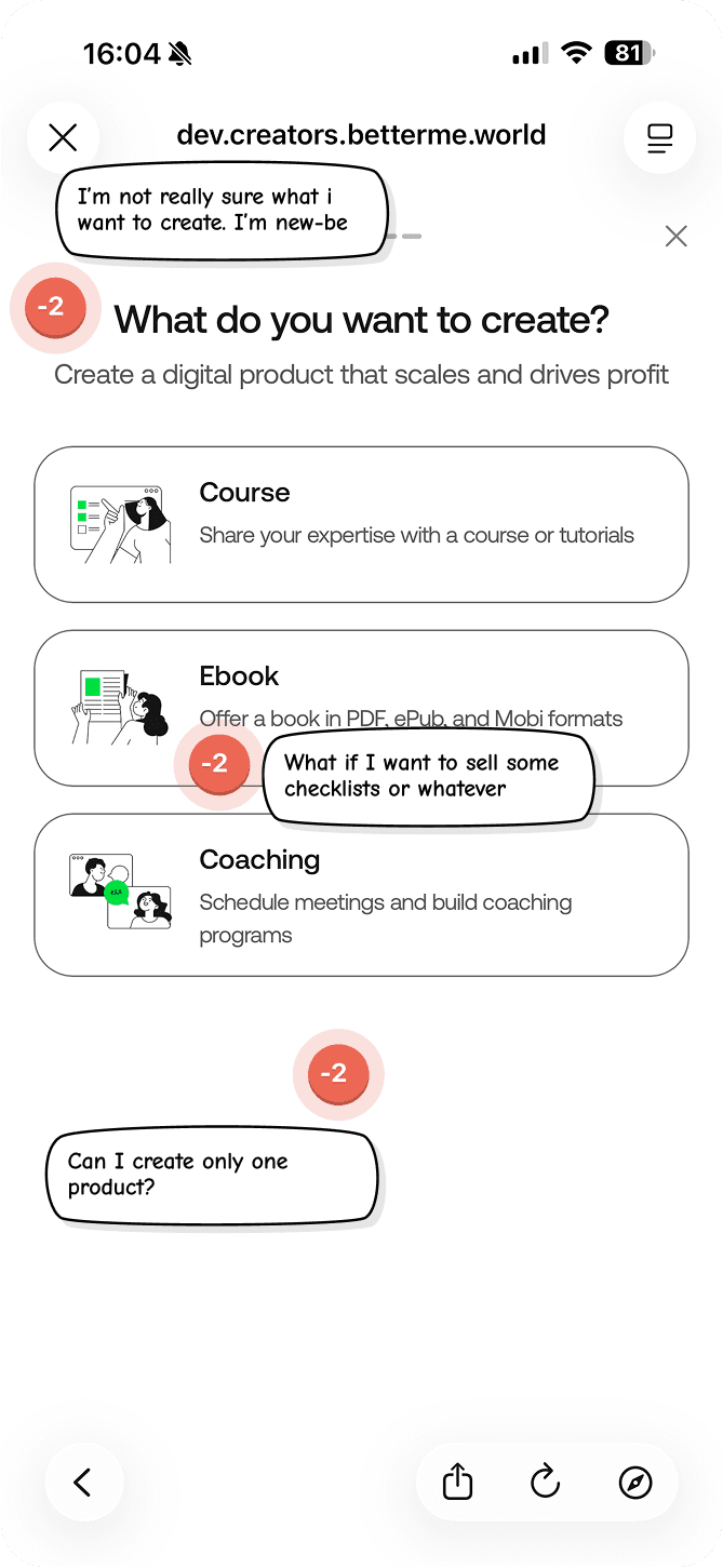


Support feedback consistently showed that new creators did not understand how to begin, what steps were required, or how the platform could help them create and sell a product.
“Unfortunately, despite my attempts, I still haven't fully understood how the application works or how to create my content on your platform.”
“I have joined but I thought there would be some guidance.
Is there any?”
“I am a beginner and not really sure what I am doing. There are no guidelines that come with it.”
Hypothesis
The first iteration had to improve activation while keeping the experience focused and achievable. This required balancing user needs, product complexity, and technical limitations.
01. Balancing guidance & cognitive load
The flow had to provide enough guidance to build confidence while keeping each step focused on one clear action.
02. Limited engineering capacity
Prioritise high-impact changes and reuse existing capabilities to validate the direction before deeper investment.
03. Third-party payment
flows
Clearly communicate external redirects, pending states, successful connections, and the path back to onboarding.
SOLUTION
Reduce the “blank page” anxiety by giving users a starting point and breaking product creation into smaller, manageable steps.
// Before: a pop-up asking the creator to start from nothing. After: a checklist that opens with the first item already done. The same checklist opens every flow – what changes per product type is the middle step, not the promise.

Solution
If users can make basic edits to the course outline during onboarding such as adjusting the course title and description or renaming modules and lessons, they will feel greater ownership and control over the product they are creating.


// Rather than passively viewing a demo, users begin shaping a real course and better understand its structure. To avoid overwhelming them, the experience should work as an editable preview: enough interaction to create a sense of progress, while advanced actions such as adding lessons, creating sections, or editing lesson content remain outside the onboarding flow.
SOLUTION
I used a morphing animation to carry the product card from the creation flow into the pricing step. The intention was to prevent users from interpreting the price screen as something they were being asked to pay for.
By keeping their product visible throughout the transition, the animation makes it clear that they are setting the price of their own product. It also creates continuity between the steps and makes the transition feel more natural.

SOLUTION
We introduced this step to help users feel that they were creating something distinctly their own, rather than simply moving through a generic platform setup.
Website personalization is an important part of preparing a product for sale, but it was previously missing from onboarding. As a result, users did not realise that the look of their website could be customised directly within the platform.
Solution
Connecting payment providers and integrations works well during onboarding because it creates a sense of investment without requiring significant effort.
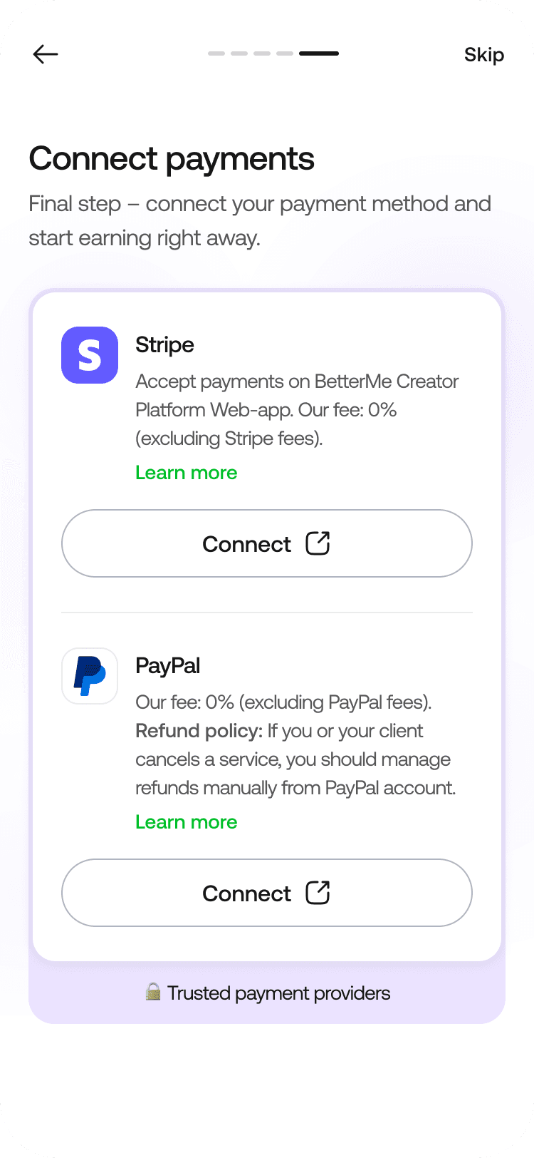


// We treated payment integration as a lightweight commitment step: it requires limited effort, brings creators closer to receiving their first payment, and may increase their motivation to continue the setup.
SOLUTION
Onboarding does not end when users complete the entry flow. We continue guiding creators inside the platform with contextual next steps that help them improve their product, explore key capabilities, and move closer to their first sale.
This ongoing guidance supports deeper feature adoption, stronger engagement, and long-term retention.